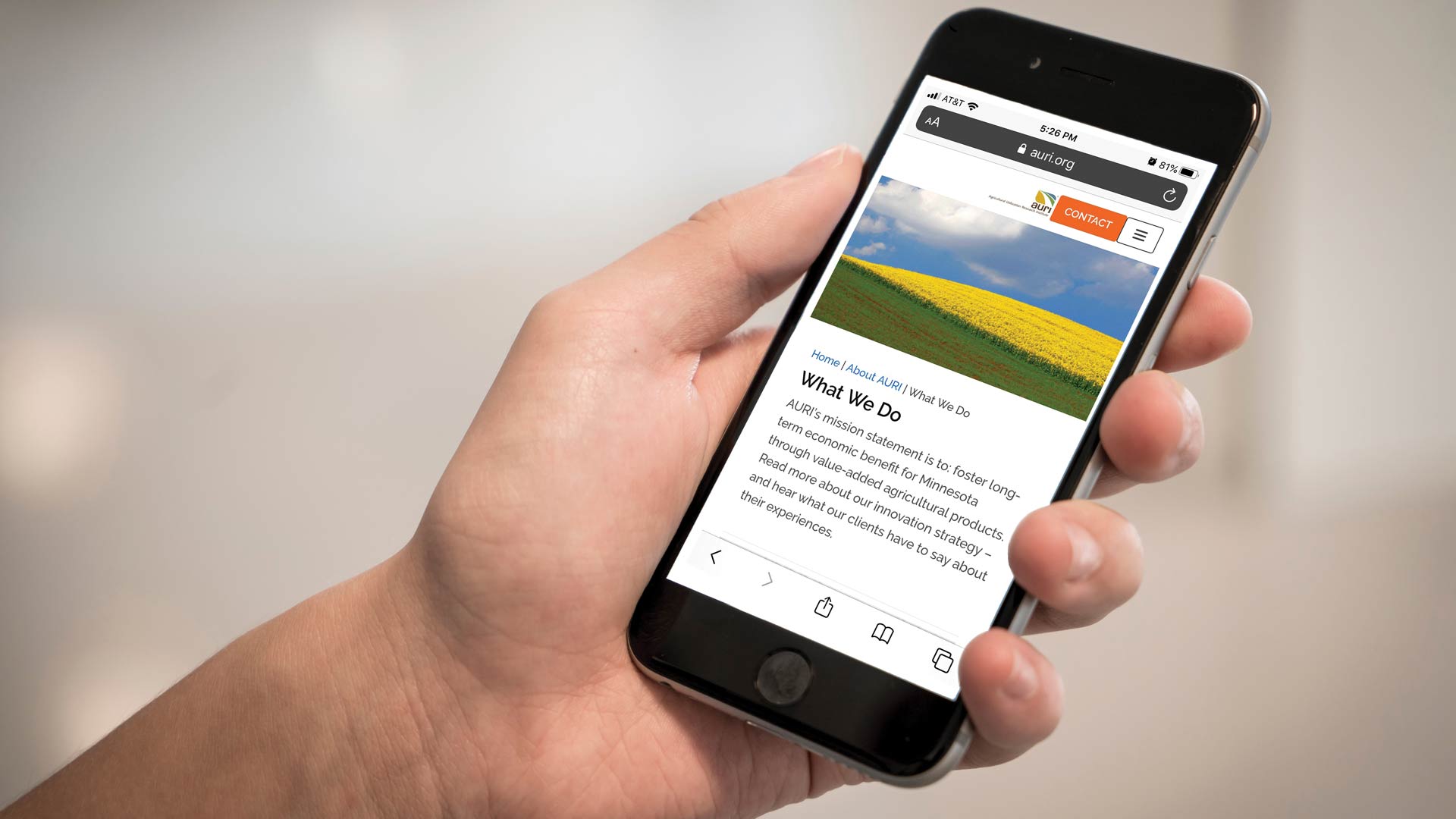
AURI’s online presence just got a whole new look at www.auri.org. Along with the complete redesign to a modern look and feel, the new website retains the same organizational layout while integrating important new features along side more robust content. The new website offers clear access to the various capabilities and programs AURI undertakes, focusing on both current and past partner projects, publications, research-based initiatives and important events. Many considerations were at work when creating this fresh look. From better functionality to strong visuals, the website redesign was a necessary upgrade from the previous site.
One of the main goals for the update was to create a site that better acknowledges and shares the innovations AURI’s client work supports. This was done by developing a user-friendly navigation system that allows visitors to the website an easy way to find information about AURI’s client work and research.
AURI’s commitment to collaboration is at the heart of its success and continues to drive AURI’s search for industry partners of all sizes. That is why the new site includes a prominent partners section.
“The partner section is a new feature of the site that will highlight projects that fall under our partnerships,” said Erik Evans, Director of Communications at AURI. Along with this new section, new responsive features and shortcuts to key information provide partners and users better access to AURI’s content on mobile devices.
The updated website also allows visitors to easily view past reports and projects. Providing AURI’s audience easy paths to vital information was an important objective to the redesign. “The user experience was a top consideration. Navigability was also very important to easily move around within the site to reach relevant information. We wanted the site to feel fresh, uncluttered and enticing,” said Lisa Gjersvik, Senior Director of Strategy Management.
The new site offers many new features including enhanced visual elements that incorporate the use of large photographs with a modern layout. Along with this new look, changes to the layout provide users with an intuitive and straightforward way to navigate the website faster and easier.
Finally, more effective and powerful search capabilities have been incorporated to bring users directly to the subject matter of their choice.
This new sleek and contemporary website is representative of AURI as an innovative brand and a forward-looking organization. “We definitely want the user to see AURI as innovative, and web experience is one of the first points of entry in many cases for a potential client and follower,” said Shannon Schlecht, Executive Director of AURI. One of the top priorities of the redesign was better curating the pages and reducing clutter. The former site needed an update not only to its graphics but an overall cleaner look.
The updated website brings a new life to the AURI brand. The ability for a mobile-friendly experience, improved user experience to access information, and improved search capabilities were the main objectives achieved in the redesign. Many within the organization along with external collaborators and other stakeholders were involved in providing feedback. The result: a positive experience for users seeking information and resources related to the agricultural industry including value-added innovations and opportunities.
